Adjusting Your Monitor Settings for Optimal Eye Health
Introduction
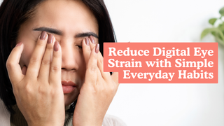
In a world where screens dominate our days—whether for work, study, or entertainment—our eyes often pay the price. Staring at a poorly configured monitor can lead to digital eye strain, manifesting as headaches, blurred vision, dry eyes, and even neck and shoulder discomfort. Thankfully, with a few simple adjustments to your display settings and workstation setup, you can dramatically improve comfort, productivity, and long-term eye health.
Why Proper Monitor Settings Matter
Your display’s brightness, contrast, color temperature, refresh rate, resolution, and text scaling all influence how much effort your eyes must exert. When these settings clash with your environment or tasks, your visual system works overtime, leading to Computer Vision Syndrome (CVS). Common symptoms include:
-
Dry, irritated eyes: Reduced blink rate when focusing on screens.
-
Blurred or unstable vision: Constant refocusing strains eye muscles.
-
Headaches and fatigue: Glare, flicker, and poor lighting amplify discomfort.
-
Neck, shoulder, and back pain: Poor posture from improper monitor placement.
By optimizing each element below, you’ll create a more comfortable, ergonomic setup that supports both eye and body health.
1. Brightness: Match Your Surroundings
A display that’s too bright feels like staring at a lamp; too dim forces your eyes to strain.
-
Ideal adjustment: Dim or brighten your monitor so that it blends with ambient lighting. In a brightly lit room, increase brightness moderately; in a dim environment, dial it down until the screen no longer glows painfully.
-
Impact on eyes: Proper brightness prevents glare-driven pupil constriction cycles and reduces tension in the ocular muscles.
With your eyes relaxed, you’ll notice fewer squinting episodes and a more stable visual field—even during marathon work sessions.
2. Contrast: Sharpen Text and Images
Contrast determines the distinction between light and dark areas on your screen.
-
Optimal range: For document editing, aim for a mid-range contrast (around 3:1 to 5:1) where text is crisp without harsh edges. For photo or video work, a higher contrast (up to 10:1) can make colors pop while maintaining detail.
-
Eye benefit: Clear separation between text and background reduces the effort needed to discern letters, preventing fatigue.
Experiment by viewing plain text against different backgrounds—your eyes should comfortably identify characters without drifting.
3. Color Temperature: Reduce Blue-Light Exposure
Color temperature shifts the screen’s hue from cool (bluish) to warm (yellowish).
-
Daytime use: A neutral-to-cool setting (around 5,500–6,500K) promotes alertness.
-
Evening use: Switch to a warmer tone (around 3,000–4,000K) using built-in modes like Night Shift or third-party apps such as f.lux.
-
Why it matters: Blue light—beneficial in daylight—suppresses melatonin and strains eyes after sunset. Warmer hues help maintain natural sleep cycles and reduce ocular stress.
By syncing your screen’s tone with the sun’s rhythm, you’ll enjoy less eye soreness and better sleep hygiene.
4. Refresh Rate: Minimize Flicker
Refresh rate, measured in hertz (Hz), indicates how often the display updates per second.
-
Common settings: Most monitors default to 60 Hz. If available, opt for 75 Hz, 120 Hz, or higher.
-
Benefit: Higher rates produce smoother visuals, reducing perceptible flicker that can trigger headaches and tension around the temples.
To change on Windows: Settings → System → Display → Advanced display settings → Display adapter properties → Monitor tab. On Mac: System Preferences → Displays → Refresh Rate.
5. Resolution & Text Scaling: Read Without Strain
Tiny text or misaligned resolution forces squinting and forward-leaning posture.
-
Use native resolution: Ensures the sharpest image.
-
Scale content: Adjust UI scaling to 125–150% so menus, text, and icons appear at a comfortable size without loss of clarity.
This simple tweak keeps your spine aligned and prevents the neck craning that often accompanies stingy font sizes.
6. Ergonomic Placement: Support Eyes and Body
-
Distance: An arm’s length away (20–28 inches).
-
Tilt: Tilt screen back 10°–20° so the center sits perpendicular to your line of sight.
Proper setup distributes weight evenly, alleviating pressure points in your shoulders and upper back.
7. Healthy Habits: Beyond Your Screen
Display tweaks help, but good habits complete the picture:
-
20-20-20 Rule: Every 20 minutes, look at something 20 feet away for 20 seconds—and stretch or stand briefly.
-
Blink consciously: Aim for 12–15 blinks per minute to maintain tear film; consider preservative-free lubricating drops if dryness persists.
-
Anti-glare filters: Matte screens or clip-on filters cut reflections from windows and overhead lights.
-
Balanced room lighting: Use soft, indirect lamps behind your monitor to eliminate stark contrasts between screen and surroundings.
Coupling these practices with optimized settings delivers a holistic defense against digital fatigue.
By tailoring your monitor’s settings and adopting supportive habits, you’ll transform screen time from an endurance test into a sustainable, comfortable part of your day. Start implementing these changes today—your eyes (and posture!) will thank you.


